A kitchen in an apartment or house is not only a place for cooking. The whole family gathers here for breakfast and dinner. In the kitchen, leisurely conversations are held over a cup of tea with friends and work colleagues. This is a small world where people live, philosophize, and enjoy communicating with each other. And the design of the kitchen space plays an important role in the design of the entire apartment.
Bronze shades are present in different styles of kitchen space design. They can be called the most attractive of all brown shades. Our ancestors also admired the metallic reflection of bronze.
Bronze was used in the manufacture of jewelry, tools, kitchen utensils, and small arms. In the Bronze Age, the wealth of people was determined by the presence of bronze objects.
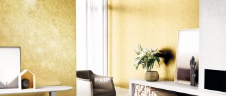
Interiors with the presence of bronze colors speak of the impeccable taste of the owners of apartments and private houses. The color of bronze is suitable for the interior of any room, but it looks especially elegant in the kitchen. When decorating a space, bronze can be used as the main background or as an additional one. Decorate the walls, floor, ceiling in bronze shades or focus only on accessories.
Decorating a kitchen space in bronze color
The classic bronze color is the general background of the room. Bronze is often used as auxiliary shades. For example, for spacious, bright kitchens, bronze color can be used as the main color for painting wall surfaces. This interior design looks luxurious, unusual, and stylish.
For small kitchen spaces, a combination of bronze and brown tones is more suitable. They can decorate the entire background of the room or highlight certain parts. For example, cover the window openings with bronze-colored curtains, order a kitchen sofa, chair upholstery, and various decorative kitchen utensils in bronze color.
Elements of bronze fittings are often used by manufacturers of modern expensive kitchen sets. You can use various inserts, handles for interior doors and cabinets as bronze decor.
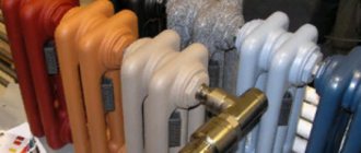
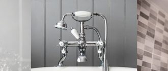
You can decorate the interior of your kitchens with elegant kitchen faucets and sinks made of bronze alloy. They are, of course, more expensive than conventional ones, but they are resistant to corrosion, the effects of chlorinated water, detergents containing acid, and have an increased service life. Household appliances painted bronze (refrigerators, microwave ovens) will also add elegance to kitchen spaces.
What are bronze and brass
Bronze and brass are alloys based on copper. Moreover, individual brands of such alloys are very similar in color, but their characteristics may have significant differences. In order to have a good understanding of the question of in which cases to use brass and in which to use bronze, it is necessary to become more familiar with their properties and chemical composition.
Chemical composition of simple brasses
Chemical composition of tin bronzes (click to enlarge)
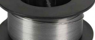
A material such as bronze has been used by humanity for several millennia, and its popularity is not decreasing. Initially, man learned to produce bronze alloys, the basis of the chemical composition of which is copper and tin. Later, with the development of the metallurgical industry, bronzes began to be produced, in which tin was replaced by other chemical elements - aluminum, lead, iron, silicon, beryllium, phosphorus, etc. Bronzes of the first type began to be called tin (they are often called bell bronzes, because they used to made bells), and the second - tinless. A change in the chemical composition of bronze leads to a change not only in its characteristics, but also in color.
Brass is also a copper alloy, but its main alloying element is zinc. The chemical composition of various brands of brass may contain elements such as nickel, lead, iron, tin, manganese, etc., but their content is insignificant and is necessary only to give the finished alloy certain characteristics. It is known that the ancient Romans knew how to produce brass, who obtained it by mixing molten copper and zinc ore. A more efficient production technology, which involves mixing molten copper and pure zinc, was developed in England, and this happened in 1781.
Physical properties of simple brasses (click to enlarge)
Physical properties of tin bronzes (click to enlarge)
For a long time, brass, which has a beautiful light golden color, was used to make decorative items, including those that were passed off as gold. However, manufacturers could not help but pay attention to other, no less significant characteristics of this alloy, which include high corrosion and abrasion resistance, ductility, combined with fairly high hardness and strength.
That is why brass, which also has good casting properties, began to be actively used not only for decorative purposes, but also for the manufacture of products successfully used in various industries.
Stylistic directions for decorating kitchens in bronze
Kitchen designers use bronze color in almost any style. Even in high-tech style, gilding can be replaced with bronze parts. There is no need to talk about the combination of bronze colors with classicism. They use elements of bronze in loft style, minimalism, modernism, even Scandinavian style.
Description of color and its brief history
Bronze color is a range of shades of yellow that range from green to brown. This tone gets its name due to its striking similarities with the metal of the same name. The color falls into the category of warm, rich, sometimes slightly bright tones. Depending on what effect you want, you can choose a bronze of a darker or lighter shade, with or without shimmer. In a word, bronze color is very versatile, it can “adjust” to your preferences and become a worthy addition to your image or interior. The peak of its popularity fell in the first half of the 19th century. One of the fashionistas wanted to buy himself material for sewing a suit in the most fashionable tone at that time - “London smoke”. However, he went to the store in the dark and did not notice that he had not bought something gray, but similar to a “billiard tire.” Since he started wearing his new suit, the fashion for this shade has spread throughout the world.
Provence style in the kitchen in bronze color
The style, which is also called rustic, has incorporated many details from other trends. Some romantic details, a little country and classic. Provence plays a special role in the design of the kitchen space, where everything should be done in natural, cozy colors.
The style is not demanding on certain area sizes. Kitchens of large and small sizes are equally suitable for him. A feature of the Provence style is the abundance of light pouring through large window openings, windows with transparent and translucent curtains. If there is not enough natural light, it is added with artificial lighting from ceiling lamps.
You can create a welcoming, calm atmosphere with furniture in light and soft pastel colors. The style is characterized by an abundance of living plants in flowerpots on window sills, in flowerpots on the walls and ceilings of kitchens, embroidered tablecloths, napkins, curtains, colored motifs on dishes and kitchen utensils. It is the abundance of textiles made of cotton and linen, furniture made of natural wood with bronze inserts and accessories that give kitchens coziness and a homely atmosphere.
The most relevant and popular color for small kitchen spaces is white. Decor made in bronze colors will help to revive the white color of furniture and kitchen walls. Dark olive color goes well with dark wood. With milky, sandy, beige tones - light olive color. Kitchens made in blue shades belong to the French classics. French designers use it more often than others in their interiors.
Neutral
Neutral colors are called black, white and gray - they go with almost everything and look good together. However, it should also be taken into account that a person dressed in black or gray from head to toe is bad manners; monochrome outfits have long become a sign of bad taste. In the summer, it is appropriate to be dressed in white from head to toe, but here accessories can help maintain the brightness - a bag, shoes, bright jewelry and details.
Any combination of gray should be well balanced. As a rule, fabrics or accessories of a pure gray shade are rarely found on sale; most often the color has a cold or warm undertone. Accordingly, when choosing color combinations with gray, you need to look at:
- to the warmth of gray;
- on the warmth of the selected color;
- on the lightness of two shades and their compatibility.
Warmth of Gray
Gray can be warm or cool.
Warm shades are best combined with warm tones - yellow, orange, red, pink, crimson.
Cool gray looks perfect if you add blue, lilac, green or blue to it.
The warmth of the chosen color
Even yellow can be cold. It is best to choose those paints whose temperature corresponds to the main temperature of the color. Warm yellow and cool blue look good with cool gray.
Lightness
This is the position that the chosen color would occupy on a stretch from darkest to lightest. It is best if the gray does not compete with his partner. Can't choose? Choose the brightest shades or pastel colors, and it is better to refrain from dark ones.
Loft style in a bronze kitchen
Characterized by dark colors throughout, rough textures, brick walls, antique-style accessories, copper and bronze-colored lamps, uncovered pipes and wires. Its modern version is dominated by light gray tones of concrete floors, unplastered surfaces of brick walls, and an abundance of metal products.
The style is built on the contrast of a rough, simple finish, which serves as the background of the kitchen space, and the original design of furniture sets. Dark colors that predominate in the loft style require additional artificial lighting installed at different levels. Sunlight is usually not enough for loft-style rooms.
Shades of blue vary in tone
In addition to brightening, dimming or darkening, shades of blue are built by adding other tones such as yellow or red.
Both yellow and red are warm colors, and it would be more logical to assume that the colors formed with their help will be warmer than the main blue tone. However, blue shades formed with the help of red will belong to the cold group, and those formed from yellow will belong to the warm group. This paradox is explained by the fact that the violet wavelength (430-390) (which is obtained by mixing red and blue) is smaller than the blue wavelength (450-440). Thus, shades of blue with a violet tint are cooler than pure blue tones.
Yellow, when mixed with blue, gives a green tint. The green wavelength is longer (530-490) than the blue wavelength (450-440), resulting in warmer shades of blue.
CONCLUSION: cool shades of blue are obtained by adding white, black and red to the pure color. Warm shades of blue are obtained with the addition of yellow and gray.
Scandinavian style in the kitchen in bronze color
It is ideally suited for small kitchen spaces, especially those located on the north side of buildings that lack natural light. The main color in the Scandinavian style is white and its shades. For additional, you can use any discreet or bright colors.
As for furniture, it should be simple, light, but at the same time elegant. Warmth and comfort in the Scandinavian style of kitchen design is created by an abundance of textiles and fur products. But you don’t have to hang curtains and curtains on the windows at all, so that they don’t interfere with the flow of daylight into the room. Furniture made of natural wood with elements of bronze decor in a retro style is selected to suit the Scandinavian style.
Makeup mixes: metallic eye shades
Almost all shades of brown in the eyeshadow palette have echoes of bronze. This color allows you to create pearl of any gray or green. To create an interesting makeup, it is better to use dark colors:
- this will favorably emphasize the small shape of the eyes;
- light colors are suitable for retouching;
- medium intensity - ideal for daytime makeup.
The base shade should be a cool color - this is the basis for morning or business makeup. For evening makeup, choose dark brown undertones with a slight shimmer. You need to apply it to the outer corners of your eyes, then you can achieve a smoky smoky-eyes effect.
Blue + grey, silver
The combination of blue and gray is classic. Next to gray, any color becomes dominant, however, there is such a thing as simultaneous contrast: this is when an additional shade of a nearby color is reflected in gray. This contrast projects our consciousness, and it is more negative than desirable. So, a pure shade of gray next to blue will look orange. To suppress this effect, it is worth using complex tones of gray.
White-blue is combined with gray: light gray, silver, lead, old wood, asphalt color. Base: white, papyrus, light beige.
Light blue is combined with gray: white-gray, silver, blue-gray, slate, marengo. Neutral: cream, beige, wet asphalt.
Gray-blue is combined with gray: white-gray, silver, lead, anthracite, marengo. Base: ivory, latte, wet asphalt.
Green-blue is combined with gray: white-gray, greenish-gray, taupe, asphalt, marengo. Basic: dark beige, wet asphalt.
VIEW COMBINATIONS WITH SIMILAR SHADES (click on color)
USEFUL ARTICLES ON THIS TOPIC (click on the picture)
Yellow – what to choose for it?
Everyone will notice this color of the sun. We also associate this color in our subconscious with wealth, courage, luxury, freshness and openness.
Yellow has a hard time finding its way into our wardrobes, even though it is the kindest color, especially for a summer look.
Yellow is light, pleasant, attractive, naive, dreamy, neat and super fresh.
When choosing yellow in clothes, wear it with warm shades of blue, green, denim, beige, mint, and lilac.
White or black colors will be relevant with yellow: they will form a good base for the image. Yellow contrasts perfectly with red, pink, and orange.
↑ return to table
Orange + beige
The combination of orange and beige is elegant and light. Beige, as a neutral color, helps to reveal the main color without disturbing its warm color. Pure, light, medium shades gently help to shine with a bright zest, giving the pair gloss and hiding excessive intrusiveness. There is also a combination with beige for you.
Light orange goes with beige: light peach-beige, light pink-beige, light yellow-beige, dark yellow-beige, dark brown-beige. Additional neutral shades: whisper white, platinum, wet asphalt. Orange goes with beige: light peach beige, light yellow beige, medium pink beige, dark orange beige, dark brown beige. You can shade the composition with vanilla ice, greenish-gray, wet asphalt. Orange-brown is combined with beige: light neutral beige, light peach-beige, light yellow-beige, dark brown-beige, dark orange-brown. You can add contrast using medium cream, taupe, black and gray. Dark orange goes well with beige: light orange beige, light pink beige, medium green beige, medium neutral beige, dark orange -brown. The composition will be strengthened by basic tones: creamy beige, mousey, black and gray.
From a scientific point of view
Plants need sunlight to grow, bear fruit, and reproduce. We know this from school botany lessons. It is impossible to achieve pure sunlight in a greenhouse, because any covering, one way or another, absorbs some of it.
Is it possible to cover a greenhouse with colored polycarbonate? It has always been believed that the material for covering greenhouses should be as transparent as possible.
However, recently, gardeners have increasingly begun to use colored polycarbonate for this purpose, choosing yellow, orange and red shades. Why choose polycarbonate for greenhouses? Which color is better?